
Workzone - Project Management Software
Project Description
I was initially hired to redesign the (at the time) outdated user interface without major UX interventions.
After the decision about new visual elements was made, I helped the front-end developer to implement the design on 100+ pages through the application, mostly by overriding the existing CSS styles and in some cases, re-structuring the HTML to support the new design.
The collaboration was very successful, so I was happy to continue working on new features and improving the existing ones as a UX/UI designer and HTML/CSS developer.
Some of the functionality I was working on: Project Boards, Project Task List, Gantt Chart, My Checklist, Reports, custom theming, advanced filters, document upload flow, comments and conversations, time tracking etc.
Design and Implementation Process:
I would first discuss the requirements with the Project Owner, create a few low-fidelity versions of the layout and flow.
After a thorough analysis and feedback from the team I would apply changes we agreed on and create high-fidelity mockups (with the design applied) for final approval of the UI.
Then I would code HTML/CSS templates and send them over to the front-end developer, along with detailed implementation instructions.
I would be available for any questions or fixes during the development phase, and finally, participate in testing of the new feature.
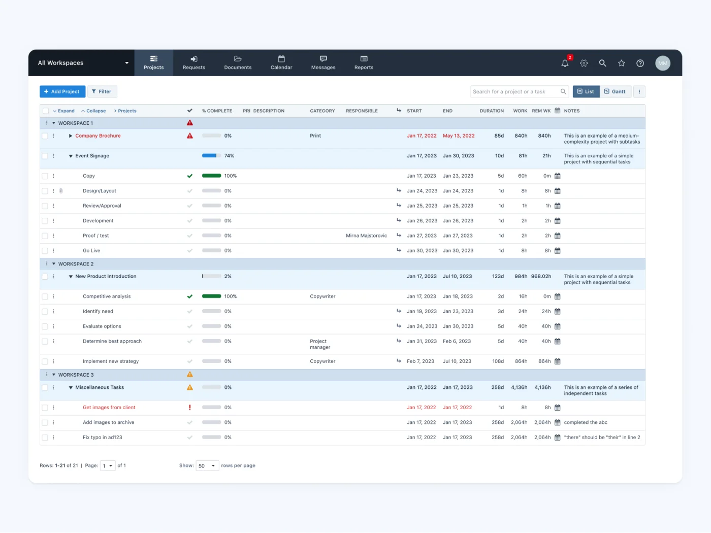
Project Management - Table View
This screen is a starting point for admin users that shows overview of current state of the projects and
tasks.
It was
important to show visual hierarchy between workspaces, projects and tasks and highlight any possible blockers.
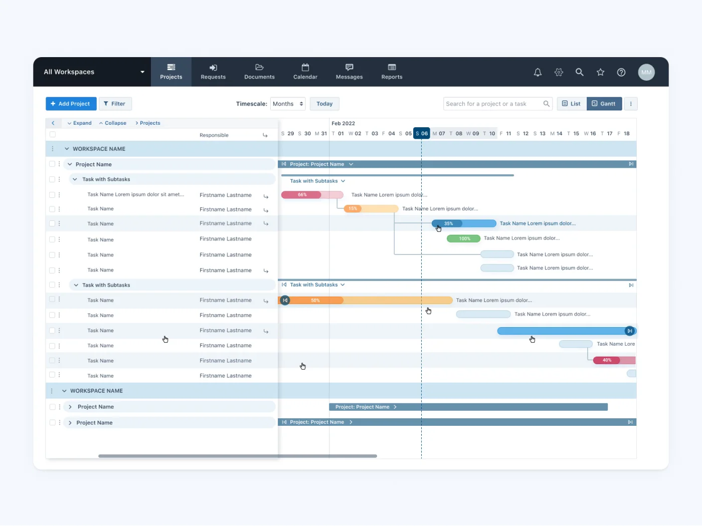
Project Management - Gantt Chart
A visual overview of the tasks in the form of a timeline - this is probably the most complex template in the
app, that allows for both horizontal and verical scrolling, collapsing left (table) part of the chart,
expanding/collapsing workspaces, projects and tasks.
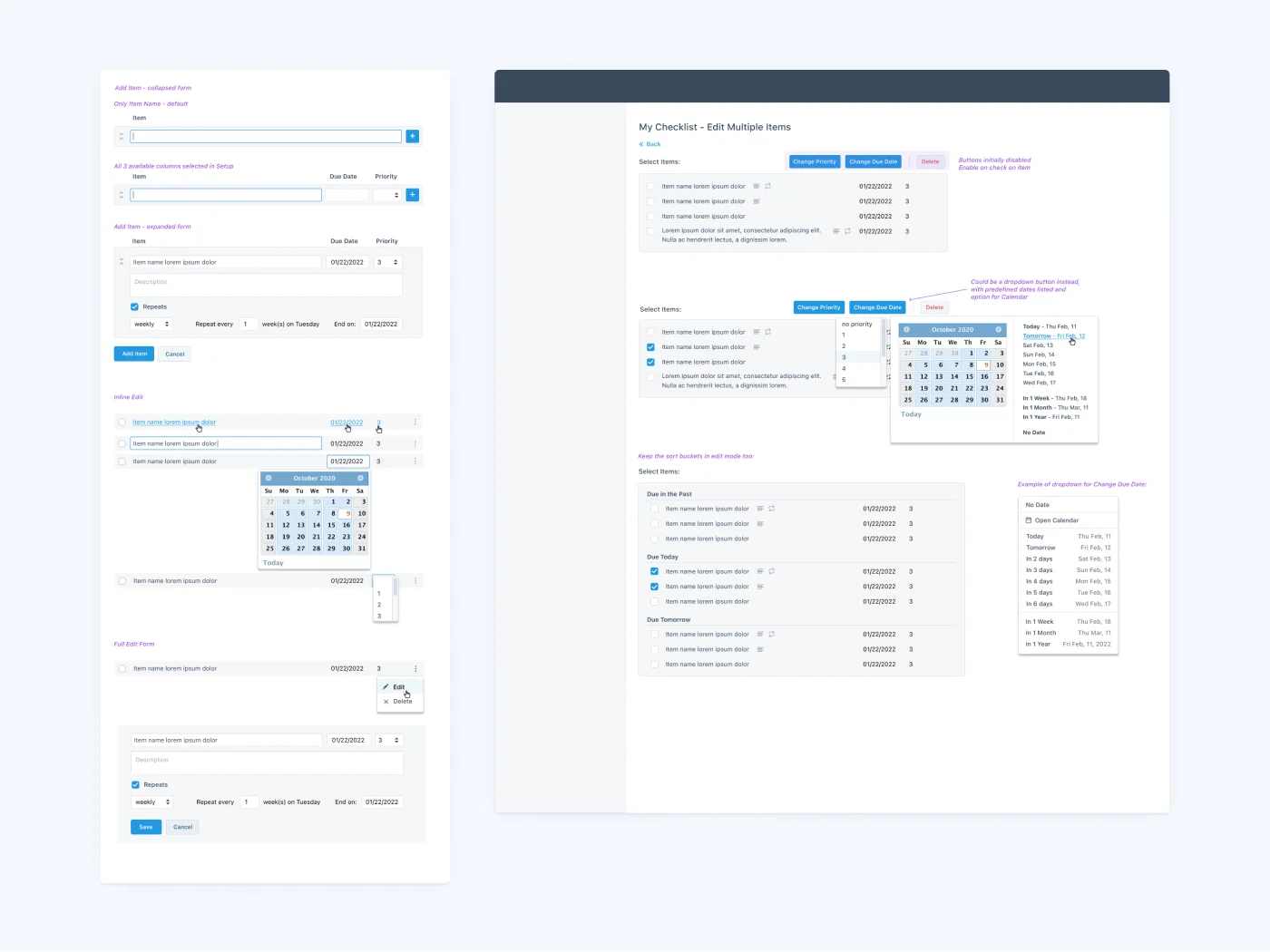
Example of a low-fidelity mockup / wireframe
As a starting point of designing a new feature,
I would first discuss the requirements with the Project Owner and create a few low-fidelity versions of the
layout and
flow. The goal was to put visual design aside and focus on functionality and flow.
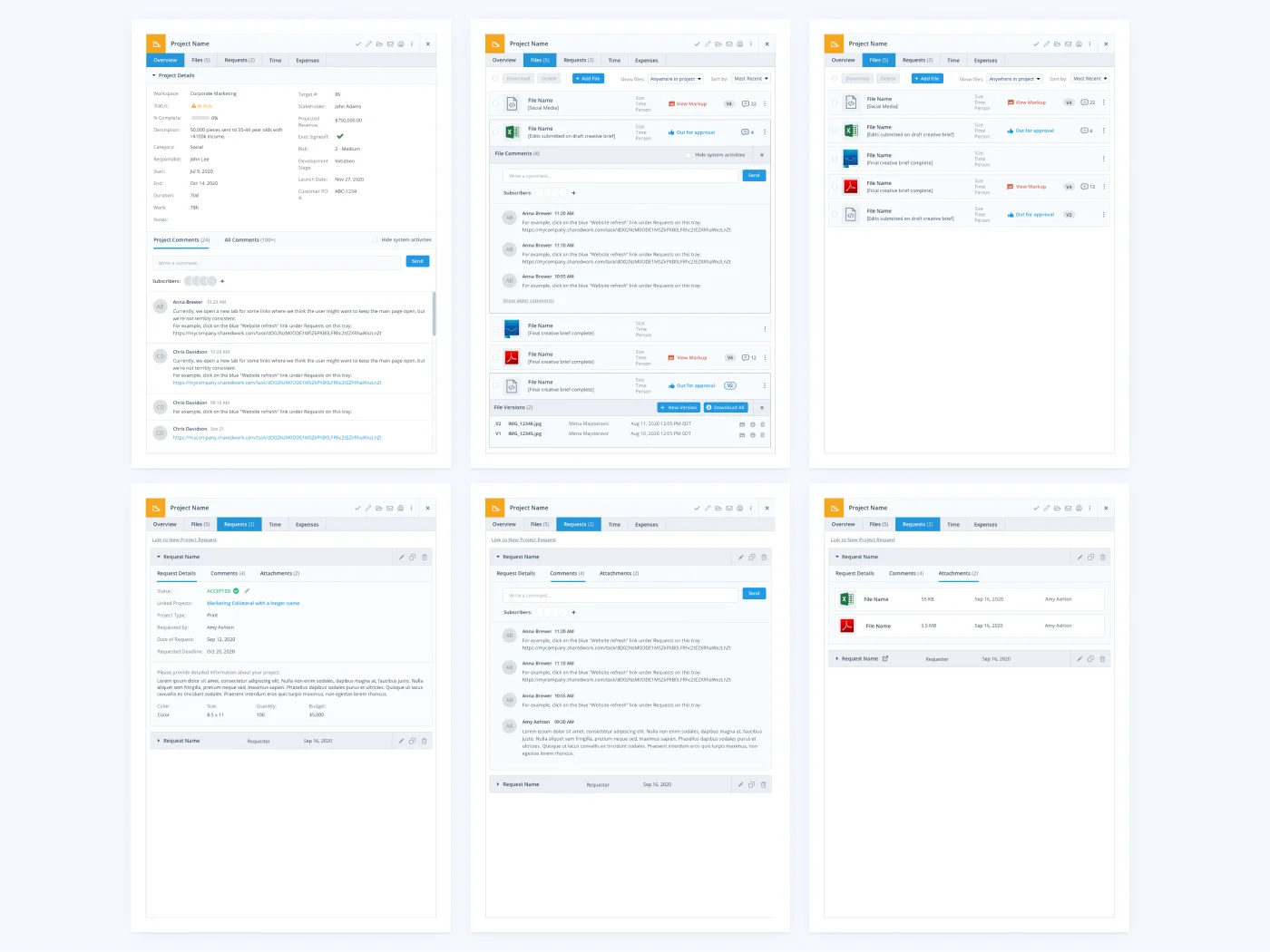
Example of a high-fidelity mockup
After a thorough analysis of low-fidelity mockups and feedback from the team I would apply changes we agreed
on
and
create high-fidelity mockups (with the design applied) for final approval of the UI
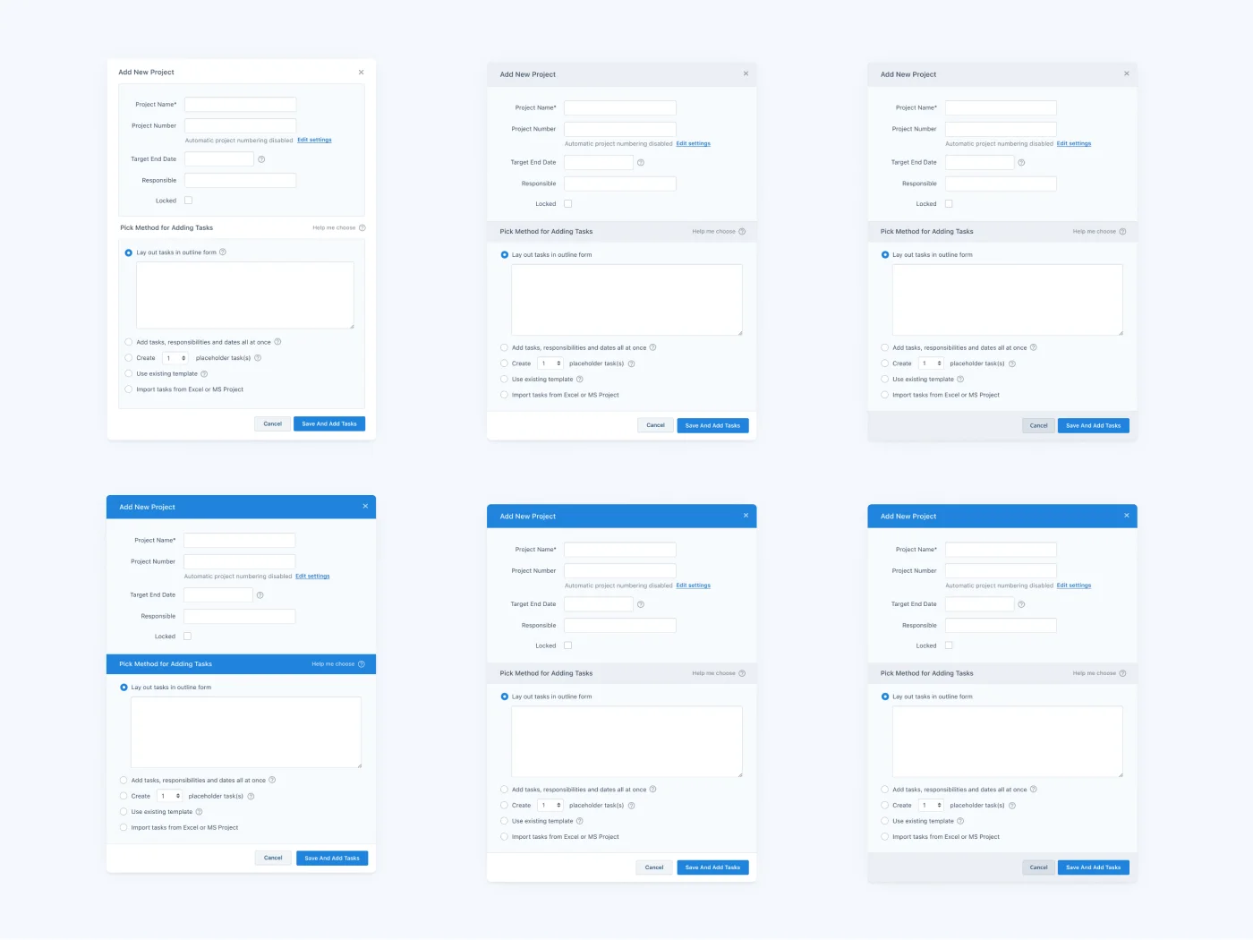
Example of several high-fidelity design variants
Some Ui elements that were used more frequently required some more design variants to choose from, so we are
sure the
final version looks and feels right. From these variants, the first one was selected, as the lightest and
cleanest.
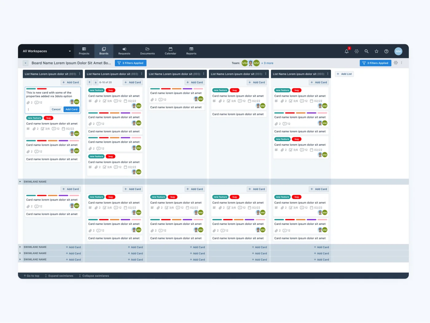
Example of a HTML/CSS template
After final approval of UI design, I would code HTML/CSS templates and send them over to the front-end
developer, along
with detailed implementation instructions. I would be available for any questions or fixes during the
development phase,
and finally, participate in testing of the new feature.
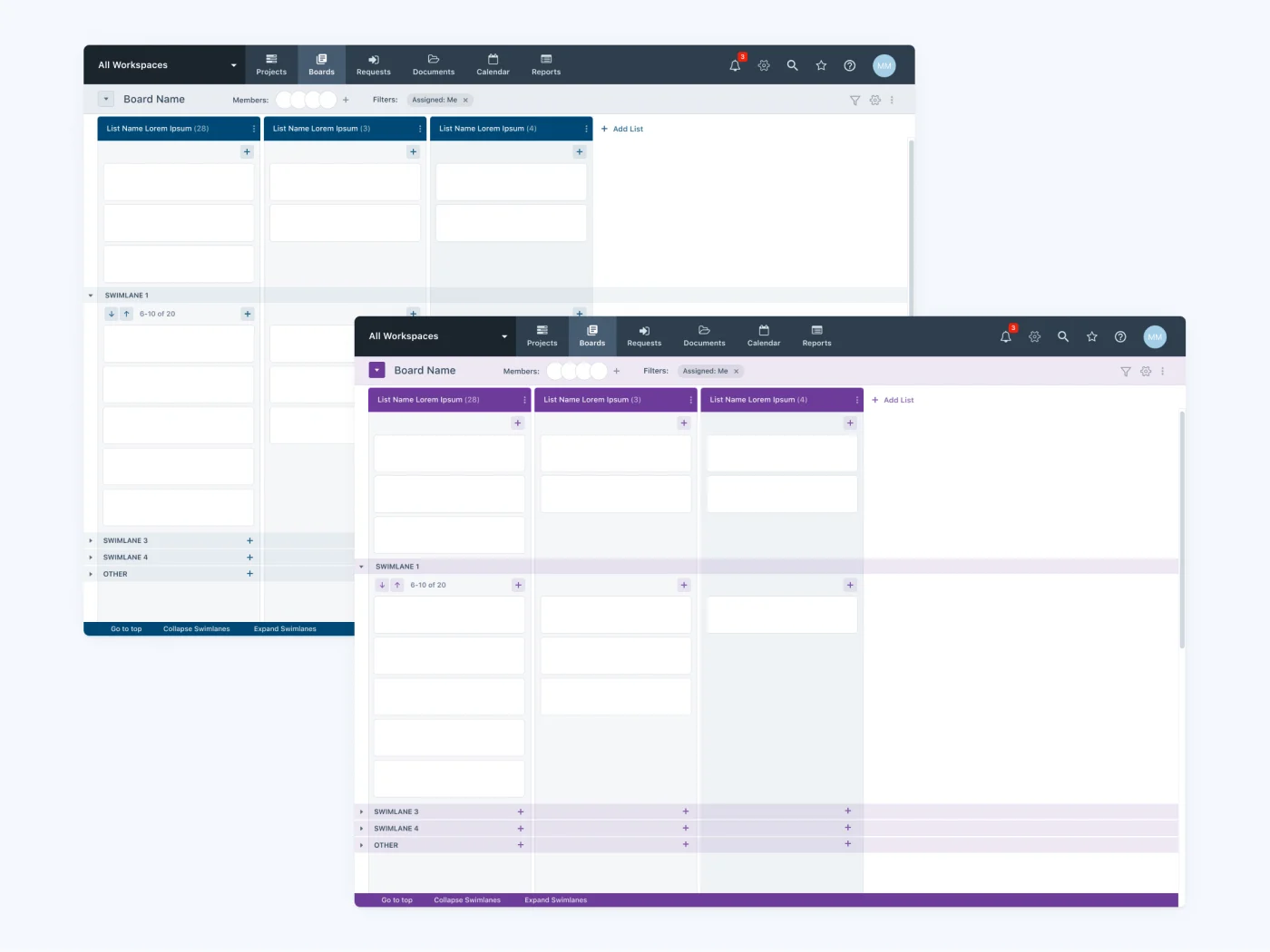
Example of theaming
Users had an option to adjust visual appearance of the app (navigation bar, colors) or parts of the app - in
this case users could choose one of the 7 board colors, so they can easily distinguish one board from the
other.
The goal was to apply different themes with as few interventions in the DOM as possible, so it's easier for
front-ennd developers to maintain the code.