
Airline Operations Analytics Software
Project Description
The main focus of the UX/UI design was to present relevant, actionable data (using data visualization techniques) in a quick, easy-to-scan format with the most relevant information understandable at a glance. The interface is clean and straightforward in order to minimize users’ cognitive load and time spent searching.
Information architecture is organized in a progressive way - the essential data is presented first, and there's a uniformed drill-down system that gives access to secondary or supporting data if needed.
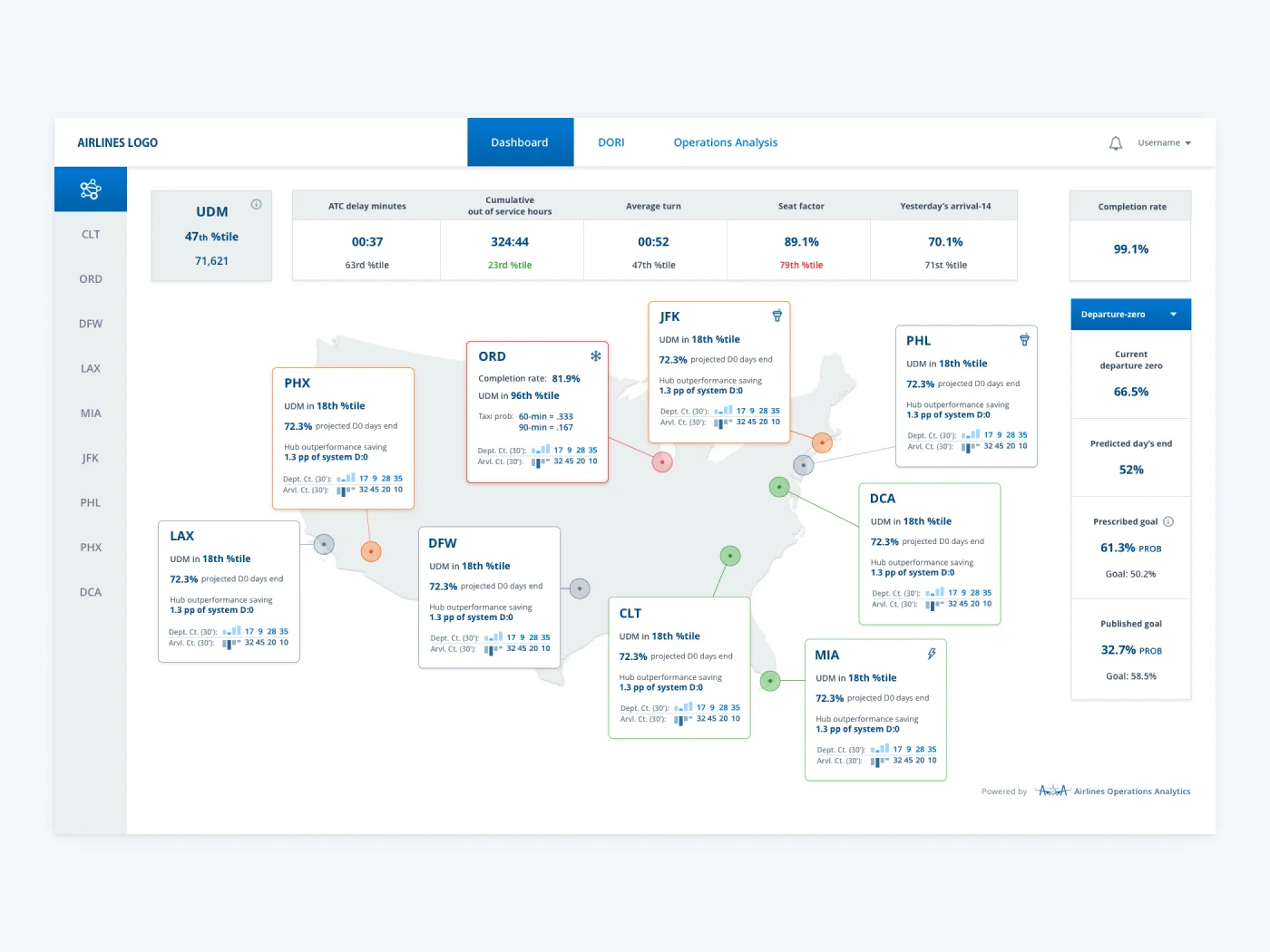
Dashboard
A starting point where operator can easily get an overview of current situation of the whole airport network -
weather
information, are flights on schedule or there are some warnings that require action.
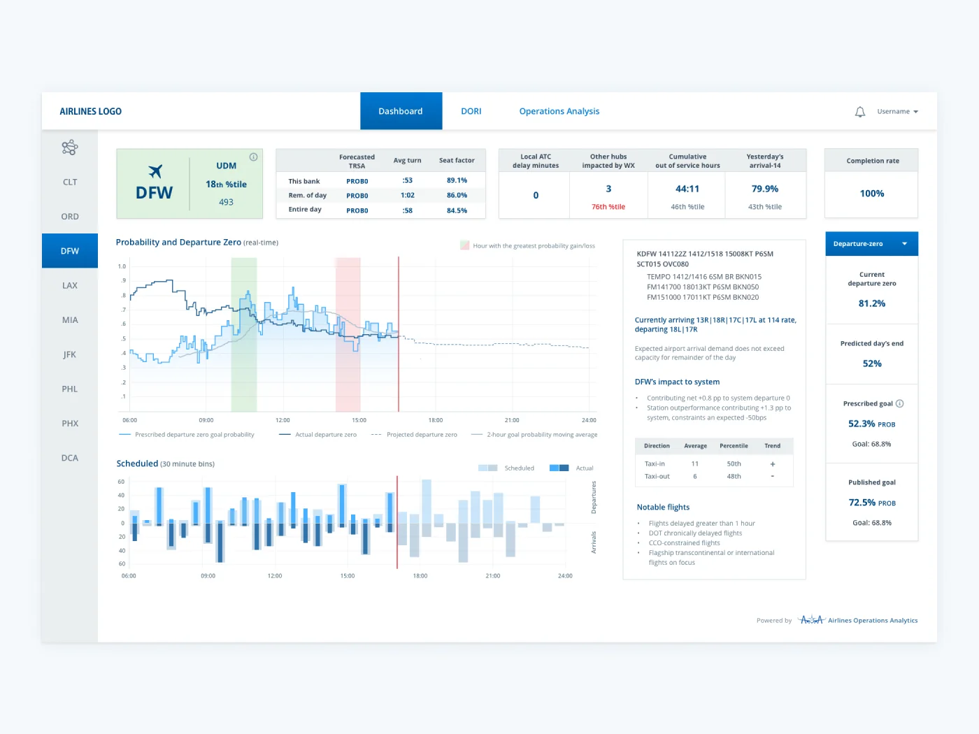
Single Airport Overview
Overview of a single airport shows actual and projected data and any discrepancy that occurs
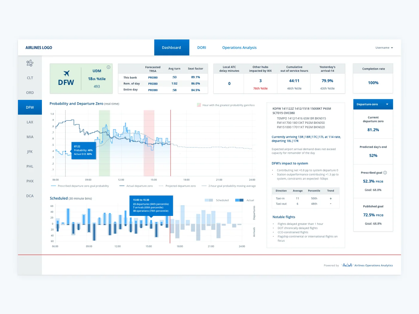
Drill-Down for More Data
Tooltips contain detailed information for each time stamp
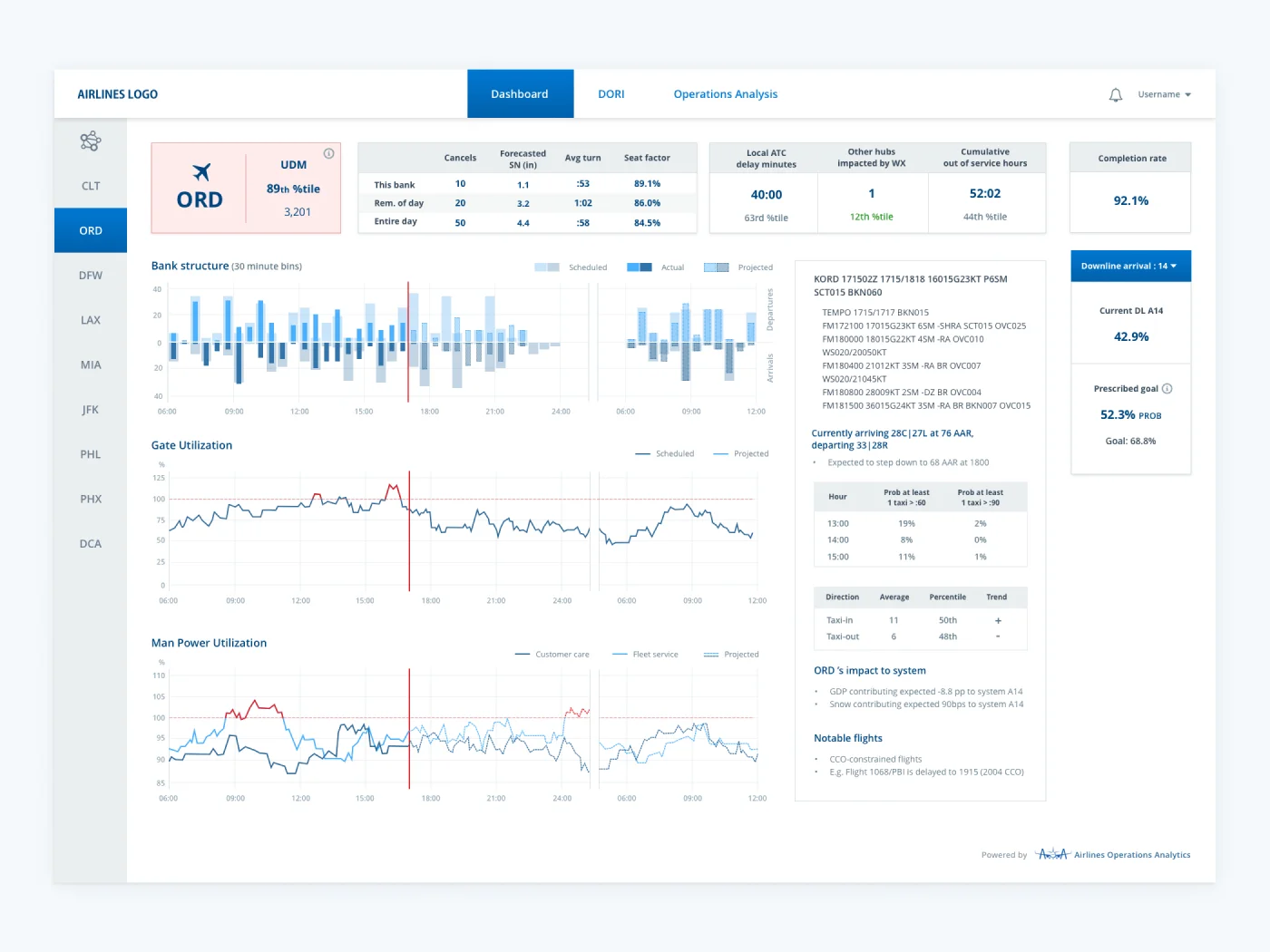
Single Airport - Warning
If there are flight delays, the screen shows different visualisations and tools that help operators make
necessary assesments and adjustments
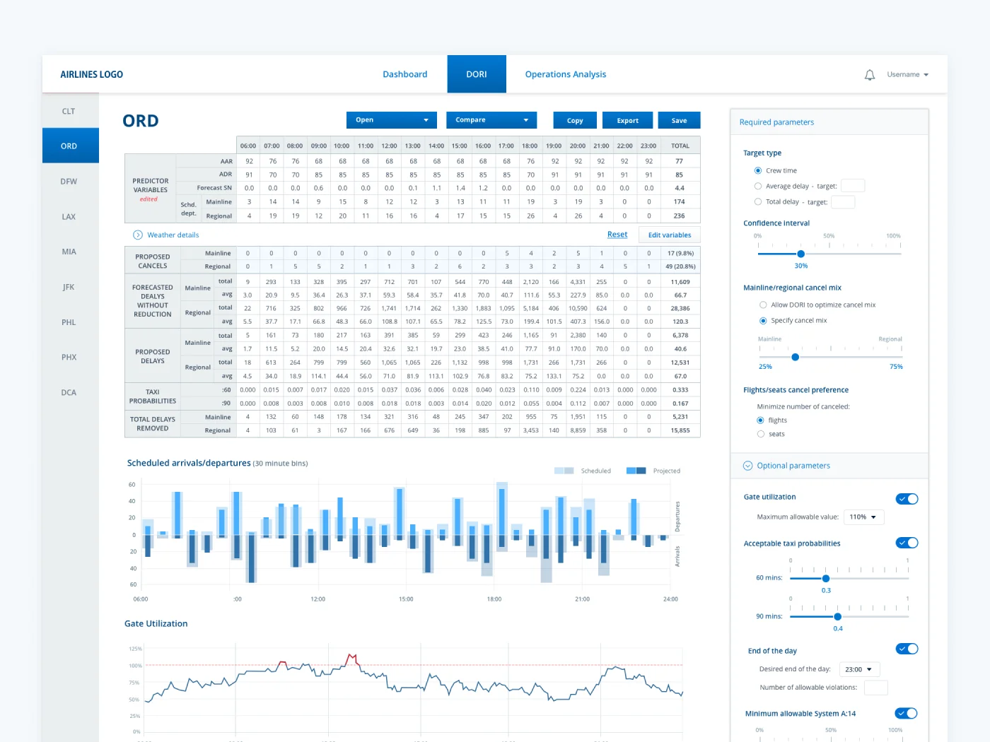
Data-Rich Screens
Light and clean design offers overview of the situation, but prevents visual clutter and cognitive overload.
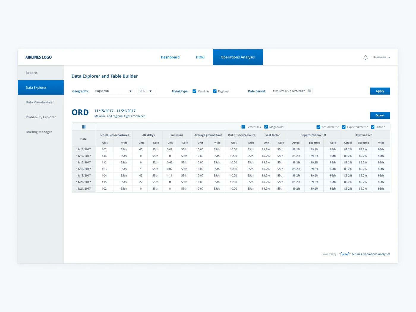
Clean Datatables with Filtering Options
Advanced filters enable operators to quickly get the necessary data and make informed decisions