ProMDM is a Mobile Device Management service - the kind of service that became necessary once companies started to integrate larger numbers of mobile devices (smartphones, tablets) into their IT environment.
First version of the ProMDM admin interface was designed as very simple and clean UI, but growing number of features required thorough redesign.

Subject Matter
Mobile Device Management is rather new service, that became necessary once companies started to integrate larger numbers of mobile devices (smartphones, tablets) into their IT environment. Each device owned by the company needs to be registered - enrolled into the system, assigned to the employee, equipped with various business applications, e-mail and wi-fi settings, authorized or restricted from certain services according to employee role. The system also enforces security measures e.g. whipes the device in case it is lost or stolen.
Context
First version of the ProMDM admin interface was designed as very simple and clean UI, but growing number of features required thorough redesign.
Redesign was tough - existing users were very satisfied with initial UI so the redesign wasn't supposed to mess up existing usage patterns. It is difficult to make improvements, but not change anything ;) but there are ways, so we put our heads together and came up with something even better than before.
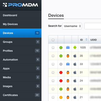
Interventions
Interface layout
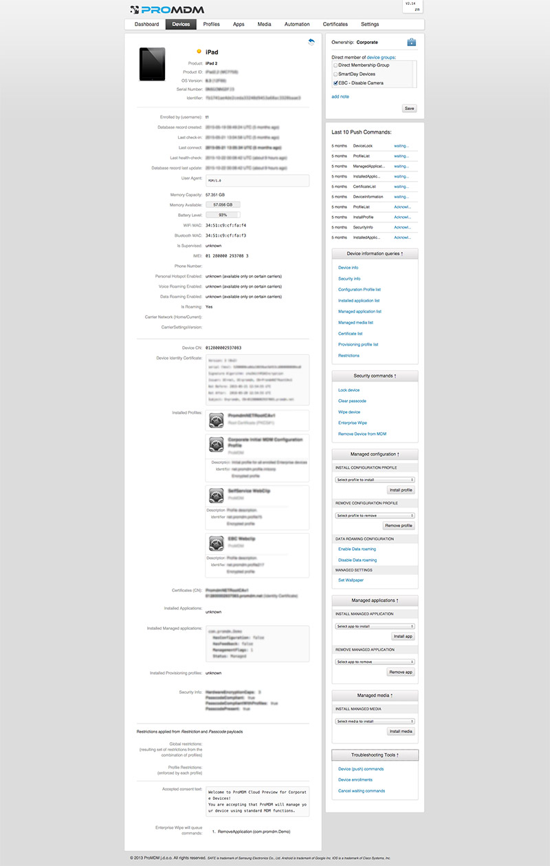
The problem with old layout was that it didn't use up the whole width of the larger screens - instead, it was concentrated in the middle, with navigation on top, and ever growing content and functionalities started to stack one below another. The interface started to feel cluttered and constant scrolling up and down was becoming the issue.
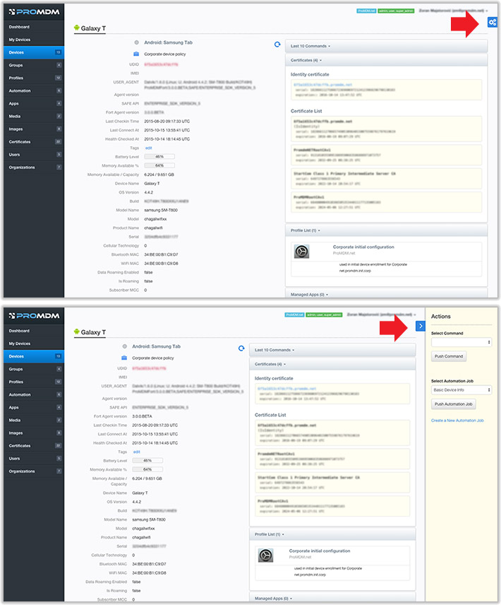
Therefore we introduced new layout, with fixed vertical navigation on the left hand side where it is always available and can contain more menu elements than horizontal navigation, which left the whole right side of the screen available for content and functionalities.
Also, we introduced the additional right section/sidebar, so the content of 3 columns can be viewed and managed in parallel, with minimum scrolling. This layout is now much more flexible and resistant to future growth of content and functionalities.
Responsive and Adaptive Layout
Admins of MDM systems usually sit in the office in front of the largest screens there are ;) so they expect all of the most common functionalities to be available on first screen, which is not unreasonable, there is quite enough space for them it just needs to be organized differently.
But it also turned out they sometimes want to use tablets, at least for some most common or crucial actions.
So we needed to figure out what those actions are, and how the layout can be organized to utilize the full width of the large screens, but to work on tablets as well.
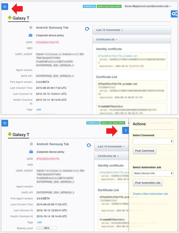
So we organized the content in 3 vertical sections - left dedicated to navigation, and center and right for content and actions - the center section contains the most important content and most common actions, and the right one is dedicated for more advanced actions and settings, or for contextual settings related to the item that is currently selected.
Middle column is always visible, and right column slides in and out on click, so user can show or hide it at his own will.
This is how the 3 columns interact based on available screen width:
Large desktop
Navigation is visible. Middle section has 2-column layout. Pulling out the right sidebar reduces the width of middle section (the two can be viewed in parallel).
Narrow desktop
Navbar is collapsed. Middle section has 2-column layout. Pulling out the right sidebar doesn't reduce width of middle section, but overlaps it.
Tablet
Both left column (navigation) and sidebar are initially hidden. When pulled out, they overlap the middle section. Middle section has 1-column layout.
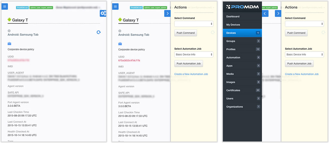
This way all the actions are available on all screens (except for the mobile phones - it is not suitable for such complex user interface and not expected to be used by administrators), they just require a few more taps to reach them on tablets.
Reducing visual clutter
 The interface is packed with functionalities and there is no space for reinforcing text with icons, so we used either-or approach - each information/action is represented either with text or an icon.
The new interface is simple and clean - whitespace is the main design element, with just a touch of gradients and shadows here and there. The icons that are left are colorful, visually prominent, because they carry important information or actions that need to be easily spotted.